
Bold Color in Pet Family Photos: How to Choose Fun, On-Trend Palettes That Still Look Timeless on Your Walls
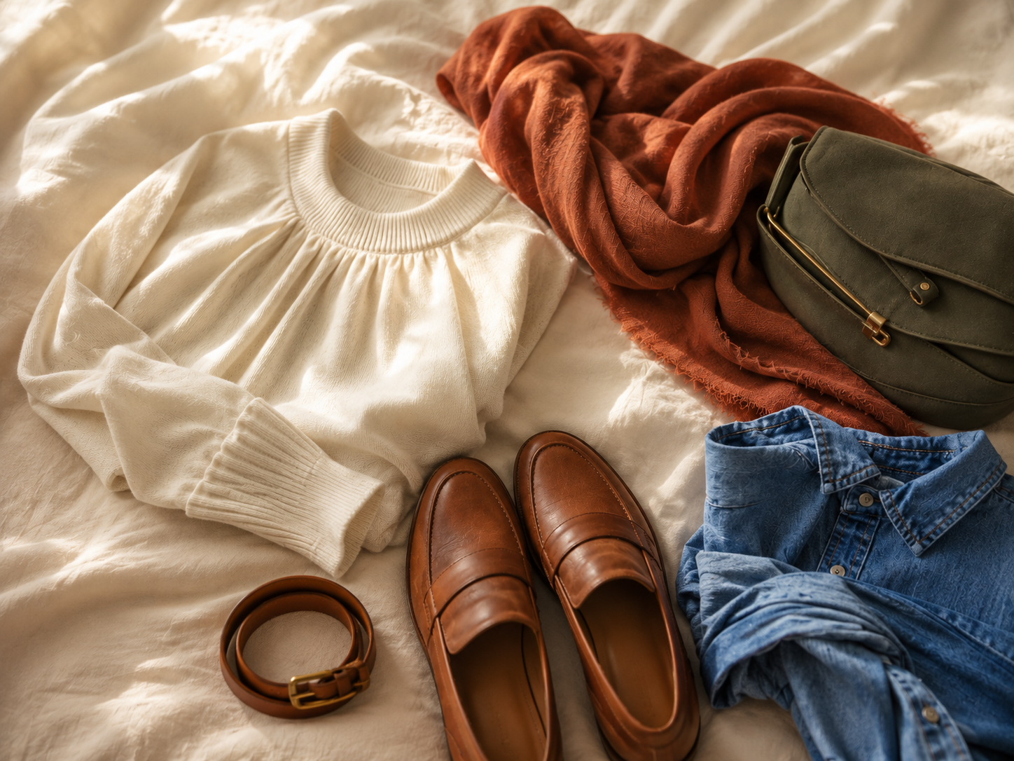
Choosing what to wear to a photo session sounds simple until you're standing in front of your closet, second-guessing everything. Too matchy? Too chaotic? And what about your dog - do their colors even factor in? For most families, outfit planning is the part of the session that quietly becomes the most stressful. But here's what I want you to know before we go any further: color is not a puzzle you have to solve alone, and when it comes together, it makes the final artwork feel genuinely finished. Not just "nice photos." Art you actually want to live with.
The Part Most Families Forget Before They Even Start
The thing I hear most often before sessions is some version of: "I just don't want to mess this up."
And I completely understand that feeling. There is a lot of vague advice floating around - "coordinate, don't match" being the classic example. That phrase is true, but on its own it doesn't really tell you anything useful.
What I find myself coming back to, every single time I'm helping a family plan their session, is this: start with the dog.
Your dog's coat color is already part of the final portrait whether you plan for it or not. So I'd rather we plan for it intentionally. Their coloring sets the foundation, and everything else - what you wear, the setting, the finished artwork on your wall - builds from there.
That shift in thinking changes everything.
A Real Example That Shows How It Works
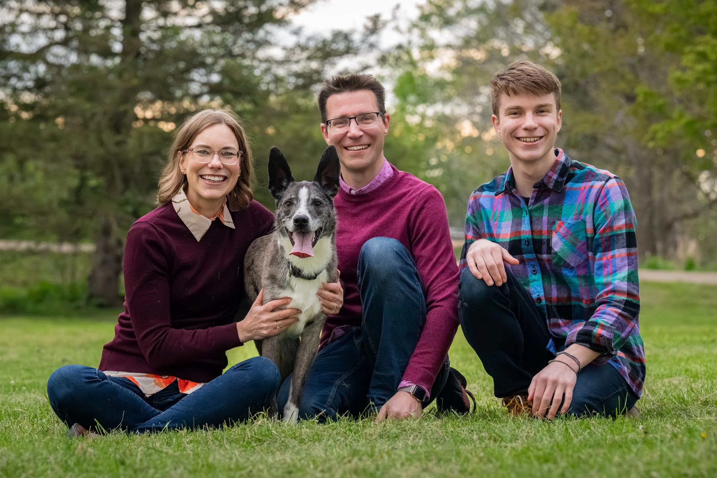
One of my favorite examples of bold color done right is a session I did for Gimli and his family, as part of my Dogs of Ann Arbor book project.
Gimli has black, gray, and white coloring - classic, beautiful, and very easy to accidentally blend into a portrait if the palette isn't thoughtful. His family chose several shades of purple: a rich magenta sweater, a deeper plum top, and a plaid shirt that brought in purple, teal, and blue together.
They were not all wearing the same color. But everything felt like it belonged in the same room.
Those jewel tones created contrast around Gimli without competing with his face or expression. He stayed at the center of the image - exactly where he should be. And because we were shooting outdoors in a green setting, the purple tones played naturally against the landscape. The final portraits felt lively and layered, without feeling loud or chaotic.
That session is what I think of when someone asks me whether bold color can still be timeless. It absolutely can - when it's chosen with intention.
My Framework for Choosing Color in Pet Family Sessions

Step One: Let the Dog Lead
Every dog's coat interacts with colors differently. Here's how I think about it:
Golden, tan, red, or cream dogs - jewel tones, deep greens, navy, dusty blue, rust, and warm earth tones all work beautifully
Black dogs - lighter neutrals, camel, ivory, denim, and muted jewel tones help create contrast so the portrait doesn't feel too dark
White or light-colored dogs - a little warmth or depth around them goes a long way, think taupe, olive, soft blue, terracotta, or layered neutrals
Gray or merle dogs - cooler tones shine here, like muted greens, slate blue, wine, cream, or soft black
Chocolate brown dogs - sage, cream, navy, rust, mustard, and denim all pair beautifully
Step Two: Think About Where the Art Will Live
Before you pick a single outfit, consider your home. What colors already exist in the spaces where these portraits will hang? A bold, jewel-toned palette can look stunning in a living room with warm wood tones and deep accent colors. A softer, more neutral palette might feel more at home in a light and airy space.
The goal is artwork you want to see on your wall five years from now. Color should make that easier, not harder.
Step Three: Choose 2-3 Main Colors, Then Add Neutrals
I usually guide clients to pick a small color family and then let neutrals do the supporting work. You don't want everyone in an identical shade, but you do want everything to feel connected.
Bold can absolutely be part of that. A rich sweater, a patterned scarf, a jewel-toned dress - any of these can be the anchor piece that gives the portrait personality. The rest of the palette just needs to give it room to breathe.
Step Four: Don't Underestimate Texture
Color gets a lot of attention, but texture matters just as much. Linen, knits, denim, suede, flowy fabrics, layered pieces - these add depth to a portrait without making it feel busy. They photograph beautifully because they give the eye somewhere to rest.
The Most Common Color Mistake (And It's Not What You Think)
I want to talk about black for a second, because it comes up constantly.
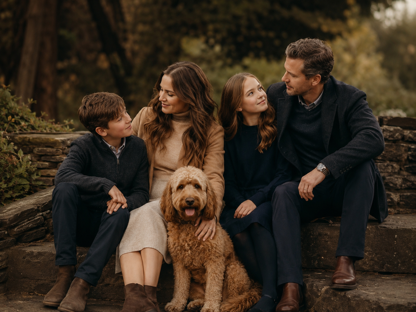
Black feels safe. It's flattering, simple, and easy to pull together. I get it. But when the whole group shows up in black - especially alongside a dark-colored dog - the portrait can start to feel heavy. People blend together, and the dog loses the contrast they need to stand out.
That does not mean black is off-limits. It just needs support.
A black top with denim, a lighter layer, some jewelry, or one person in a softer tone can work beautifully. The issue isn't the color itself - it's when there's no contrast or breathing room anywhere in the frame.
The same principle applies across the board. Any color, even a bold one, works when it has something to play against.
Why This All Matters More Than You Might Expect
I started West Oak Pet Photography because I know what it feels like to look back and wish the photos were better. Growing up, the only photos I had of the dogs who shaped me were grainy, poorly lit snapshots. That experience is part of why I care so deeply about the finished artwork - not just the session itself.
Color is one of those details that seems small in the planning stage and becomes everything in the final print. A thoughtful palette is part of what makes a portrait feel like heirloom art instead of just a nice photo. It's what makes the image feel like your family, in this chapter, with the dog you love.
And when that portrait is framed on your wall, you'll feel it. That sense of it being finished - really finished - is the whole point.
You Don't Have to Figure This Out Alone
Part of what I do is help you take the stress out of these choices before your session ever starts. Color guidance is built into the experience, because I'd rather you show up feeling confident than spend the week before your session spiraling over what to wear.
If you're starting to think about booking a session - or if you're just curious what it might look like to have heirloom portraits of you and your dog on your walls - I'd love to connect.
You can learn more about working together here.
And if your dog is the wildly energetic, refuses-to-sit, totally-unhinged kind - even better. We'll figure out the colors, and then we'll let them be exactly who they are.
That's usually where the magic happens.